
We are proud to announce the addition of buoy forecast graphs to Swell Matrix. These graphs show all the detailed information in the forecast tables but they let you see the wave trends for the week in an instant.
The style of graph is called a bubble chart or plot. These are cool because they show a ton of information at once without being overwhelming. Here’s a look at the Waimea Buoy during the Sunset Beach Triple Crown of Surfing contest:
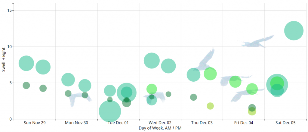
A typical line graph only shows two axes of information at once, like wave height over time. A bubble plot shows this but uses the bubble points to show two more axes. In our case, we are interested in the wave period and direction. So we made the bubble size correspond to the wave period and color refer to direction.
Tapping or clicking the bubble gives you the specifics on each swell train that’s coming in. If the graph is looking a little crowded, you can filter a swell direction from the chart by tapping its box along the top.
If you notice a day missing from the bottom of the chart, that means the waves are forecast less than one foot. Plan on a bike ride or something…
We are still polishing up the graph pages and haven’t linked them up to the home page yet. We will be publishing another post describing in detail how to interpret the graphs. Look for more improvements in the near future! Hope you score some waves!